伊莎貝爾-小味道
is a taste
- 餅乾禮盒包裝設計丨攝影企劃
愛的幾何學_菱格 Geometry of Love – Rhombus
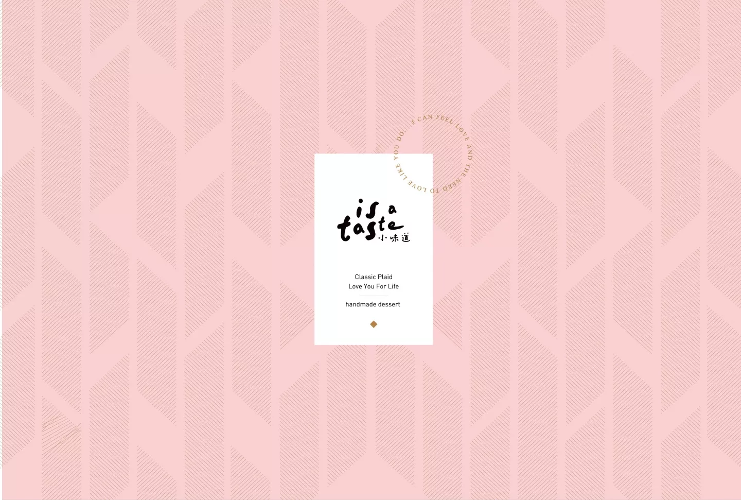
「唯有共同經歷,才能成就愛情的模樣。」以愛的幾何學為軸心概念延伸的菱格設計款,經典菱格,喻意愛情裡堅不可摧的誓言,雋永而彌新。
菱格,一直以來都給人經典不敗、耐人尋味、經得起時間洗滌的印象,在設計思考時希望屏除最傳統的格紋表現,將菱格轉化為更細膩、內斂又不失時尚的個性。
不選用色塊的設計手法,反而透過細緻線條的聚合構成菱格,如同兩個人彼此走過的每一段故事和時間的軌跡,才能凝聚成恆久不變的愛情。
而菱格的塊面比例和律動高低交錯,構成一面經典而帶著低調奢華的圖騰,風格上呼應品牌歐式個性,在一點點前衛時尚中又保有甜美氣息和獨創菱格圖騰的氣質。
logo的編排位置延續系列一致的形象識別,強化品牌未來在展示露出的形象,未來設計款禮盒一字排開,能充分彰顯品牌旗下典雅而鮮明的系列個性。
在色彩上以金色作為菱格的主色調,呼應經典而雋永的寓意,結合婚嫁喜餅最廣受喜愛的溫柔粉色作為主色系,禮盒底部更刻意採用不規則的律動菱格,如同旋律般視覺意境,訴說愛情是動態的、是有生命力的樂章。細節更透過小字的英文編排增加細膩度,局部加工打凸的效果,一如刻下印證,意喻一場婚禮是見證真愛的時刻,更為整體禮盒增添質地和設計層次。
愛的幾何學_圓心Geometry of Love – Circle’s Center
「畫個圈,成就一個圓,沒有起始,也無所謂終點,只有永恆才是真正存在。」愛情就像幾何裡的圓,像時空的流轉牽引著兩個人相遇、結合而圓滿,進入彼此的世界後,天長地久的相愛,共築一個家、一個共有的生活圈。伊莎貝爾旗下的手工喜餅品牌「小味道」的這款禮盒,希望以「圓心」為概念,傳達愛情最美的模樣。
依循小味道歐系現代時尚的品牌個性,因此無論是在色調或設計的細節上,都希望保有微甜、浪漫,且帶一點前衛時尚的愛情氛圍。
「圓」為根基,透過圓型、手感線條排列的圓、類圓型如花朵轉動的圖像,有疏有密之間的律動,融合小圓點綴成樹枝和小花的意象,優雅的交織成一面pattern,象徵彼此相愛、相處所共築的圓心,是圓滿、綻放、帶有生命力、美好而和諧。
整體營造出現代時尚,保有溫潤又不失清新的氣質,logo在包裝視覺上以簡約俐落的色塊呈現,別緻大方卻不複雜,符合未來在發展系列禮盒的圖騰表現時,建立一致而鮮明、典雅的品牌識別形象。
色彩規劃上特別選用二款特別色,象徵愛情甜美的粉潤色和富含想像空間,給人清新如沐般感受的湖水綠,後加工以燙金的手法呈現部分英文字體,及植物意象的圓,英文字體則採用打凸呈現,在有限的預算上構成雅緻、內斂,不繁複的包裝效果。
“Only by sharing an experience can we the experience and achieve the appearance of love.” The rhombic design extends from the concept of the “geometry of love”, symbolizing the indestructible vow of love, yet always being renewed.
The rhombus has always given the impression of being unassailable, intriguing, able to withstand the tests of time. Thus, in the thought process behind the design, the hope is to remove the more traditional plaid design, using the rhombus to create a more delicate, poised and stylish design.
Instead of using a color block design method, the design is built on contour lines that aggregate forming a rhombic shape, much like the traces left behind in the story and timeline that builds the foundation of the everlasting love between the journey of two loved ones.
The rhombus’ proportions and patterns are interlaced to form a vintage look with a discreet sense of luxury. The style echoes the brand’s European feel with a sense of avant-garde fashion, while retaining the sweetness and uniqueness of the rhombic shape.
The layout of the logo follows the basic brand design of the entire series, further strengthening the brand recognition. Thus, when the entire series are lined up and displayed, together they will fully demonstrate the brand’s sophistication and unique personality.
In the terms of color, the main color of choice is vintage gold, echoing a sense of timelessness, combined with the popular gentle pink used in many wedding cake designs. The bottom of the gift box deliberately uses an irregular rhombic design pattern, visually symbolizing that like a melody, love is dynamic and alive. The design is further enhanced by detailed arrangement of small English characters, adding a touch of embossing to create a layer of texture to the packaging, emphasizing that a wedding is the key moment we witness true love.
“Draw an arc to make a circle, with no beginning and no end, only what is eternal is real.” Love is like the circle in geometry, symbolizing how the ebb and flow of time and space bring two people to meet, joining them together to complement each other. As they enter in each other’s world, long-lasting love begins, and a family is established, thus completing this shared circle of life. Isabelle’s gift box for the handmade wedding cake brand “Is a Taste” hopes that through the concept of the “circle’s center”, it can draw out the wonderful shape of love.
In harmony with the avant-garde European personality of the “Is a Taste” brand, the color and design details stay true to the brand by creating a sense of serenity and romance, while still staying in tune with what is fashionable and keeping up with an overall atmosphere of love.
With the “circle” as the foundation, the design uses contour lines arranged visually into circles, imitating the rotation of flowers, creating a spatial equilibrium. Furthermore, the overall visual employs small dotted circles, branches with small flowers, all stylishly interwoven into various patterns, to carry the message that within the center of mutual love and support lies a wholesome, flourishing vitality, exuberating with beauty and harmony.
All in all, creating a modern and fashionable design, while upholding a feeling of gentleness and freshness. The logo is presented in a simple color block on the package, elegant but not too complicated. It creates a baseline for future development of any gift box series designs, establishing a consistent yet distinct brand recognition.
The color scheme design employs two special colors: a sweet pink color, which symbolizes love and a lake green, which represents the richness in imagination and freshness. The post-processing involves using thermoprinting the English letters, and just like the circular theme of the flowers, the letters are arranged in a convex shape, creating a sophisticated, stylish, calm yet simple effect on the packaging using limited budget.


