貓頭鷹藥局
Dr. Health
- 藥局品牌識別系統視覺設計 | 品牌應用設計 | 指標識別設計
你對藥局的傳統印象是什麼呢?當藥局不再只是提供藥物販售、診所、醫院的處方籤,而是致力於深入在地居民的生活保健需要,提供更多貼心的諮詢和服務,改變過去給人充滿藥味和冰冷空間的印象,充滿了親切和溫度,實際上對於一般大眾反映出的消費意願,相對產生了更多的可能。
「貓頭鷹藥局」就是一家嶄新概念的社區藥局,因為偏鄉人口外移嚴重,期盼能在非主要城市紮根,不只為鄉鎮地區的居民帶來專業完善的藥物諮詢、長青族的保健、養生資訊分享,讓偏鄉醫療資源較缺乏的銀髮長輩們,就像多了一個親切的好鄰居,提供安心便利取得慢性處方籤,甚至享有送藥到府的貼心服務。
貓頭鷹藥局的視覺定位,是希望突破傳統,並且在純樸的鄉鎮上無論各個年齡層經過都能產生一目了然的記憶點,即使年紀較大的長輩經過也能從識別上清楚知道這是一家藥局。
透過「貓頭鷹」與「藥丸」意象的巧妙結合,簡單而有力,一眼就能輕易辨識,在色彩計畫上也企圖突破一般藥局的色系表現,更溫暖、繽紛、活潑,同時呼應貓頭鷹藥局多元而周全的服務。
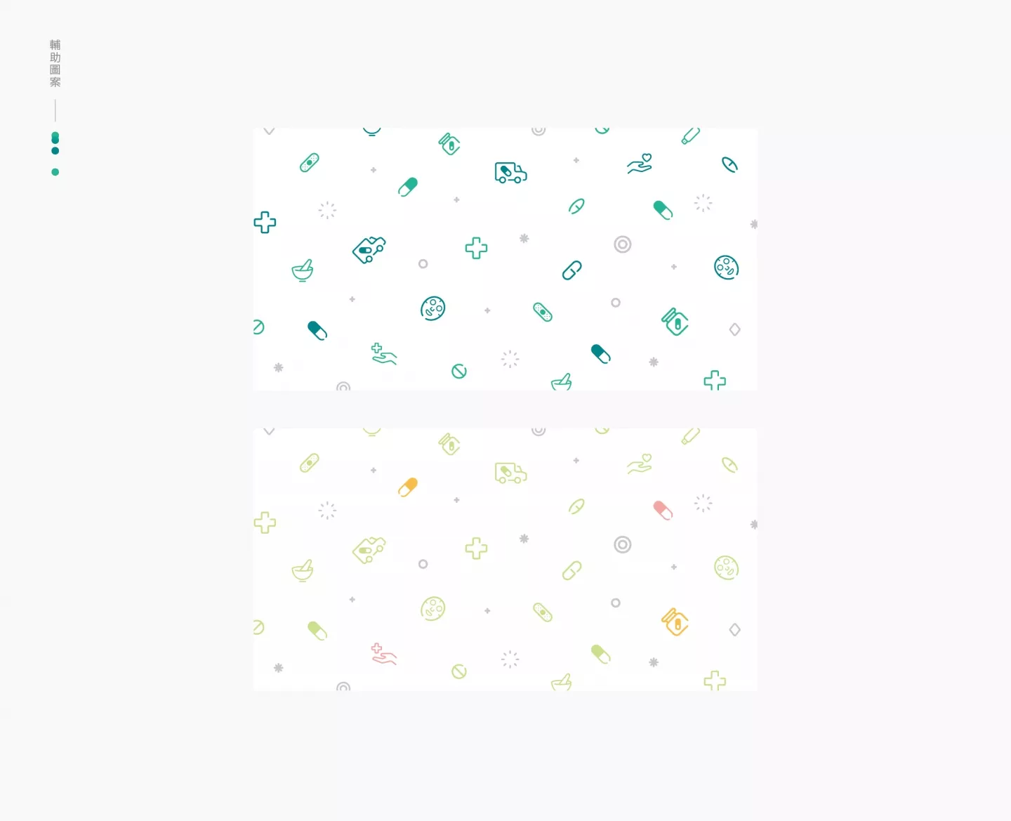
圓潤的icon式輔助圖形,充分展現整個品牌的核心元素,清楚卻靈活而不呆板的傳遞出品牌之特色與專業性,無論是輔助色的規劃又或輔助圖形的編排設計,應用在空間上的識別又或平面上的視覺形項建立,都展現了專業且鮮明的能量。
What is your traditional impression of a pharmacy? What if the pharmacy doesn’t just sell over-the-counter drugs and meet the prescriptions from clinics and hospitals, but rather, is fully committed to meeting the deeper health needs of the customer, providing insightful counseling and services. What if we can change the traditional perception of a pharmacy, the stereotype that it is distant and full of the stench of medicinal, and rather create a space of intimacy and warmth, actually increasing a consumer’s desire to walk in, creating new possibilities.
“Dr. Health” is that brand-new community pharmacy. With a shift in population into the urban cities, the goal is to take root into non-primary cities, providing professional and comprehensive drug consultation and health care for the residents of the township, sharing health information, and providing for the elderly. Furthermore, the hope is that just like a caring neighbor, we want to provide the elderly, who lack medical resources, a place where they can safely and conveniently obtain their prescriptions, and even enjoy the exclusive service of having those prescriptions delivered to the door.
The goal of the visual brand design for Dr. Health is to break through the traditional pharmaceutical image to stand out in every town, become a clear landmark. Furthermore, the design has to transcend age and generational gaps, so that even the elderly can clearly identify it as a pharmacy.
Through the simple, yet powerful ingenious combination of the elements of the “owl” and “pill”, the design can be easily recognized at first glance. Furthermore, in terms of colors, the design attempts to break free from the general color scheme of pharmacies, using warm colors that are livelier and more flamboyant to fully echo Dr. Health’s multi-faceted and comprehensive services.
The sleek icon-type auxiliary graphics fully demonstrate the core elements of the brand, clearly and creatively portray its key characteristics and the professionalism behind it. Moreover, with every thoughtful planning of auxiliary colors, the layout of auxiliary graphics, use of space, visual graphics, the brand validates its expertise and vividness.


